Get to know the newest version of the worlds most popular front-end component library.
In January 2018, Bootstrap 4 (aka v4) finally got released after being in alpha for over two years. It represents a major rewrite. Not only are there a lot of changes under the hood, but there are also a few new concepts you’ll need to wrap your head around.
So in this tutorial, I’m going to explain the most important changes from Bootstrap v3 to v4. I’m assuming that you’ve used Bootstrap previously, so I won’t explain the basics.
You can also check out our free course on Bootstrap 4 on Scrimba.
Want to learn Bootstrap 4? Here’s our free 10-part course. Happy Easter!
Now let’s have a look at the most important changes (in no particular order):
#1: Flatter buttons
Let’s begin with a fun and visual one! The buttons in v4 have a flatter design than they did in v3. Here are the previous buttons:
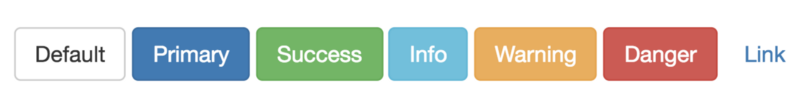
And here are some of the new ones:

This is more in line with more modern design guidelines like those found in Material Design, which has become hugely popular in the last couple of years.
#2: The media queries are better
Bootstrap v3 had too few breakpoints for its grid, in my opinion, as the lowest one, xs, was at 768 px. A lot of traffic usually comes from screens narrower than that, so this has been frustrating for many developers.
So now they’ve added a new breakpoint, xl. This one takes the role lg used to have, and pushes the rest of the breakpoints downwards, making the range go all the way down to 576 px.
$grid-breakpoints: ( xs: 0, sm: 576px, md: 768px, lg: 992px, xl: 1200px) !default;
This makes it easier for you to construct grids which work well across all screen sizes.
#3: Flexbox support gives you more flexibility
The famous Bootstrap grids are now created with Flexbox instead of floats. At first sight, this doesn’t make a huge difference for you as a developer, as most grid layouts work exactly the same. However, it does open up a few more possibilities.
Previously, you had to define the width of each column (from 1 to 12). Now you can define the width of one column, and then let the other ones be automatically set by Flexbox.
Here’s an example of doing exactly that:

As you can see in the markup below, we’re only setting the width of the middle column to be 6 (which equals half of the full width) and then the rest of the columns will simply take up whatever space remains.
<div class="container">
  <div class="row">
    <div class="col">1 of 3</div>
    <div class="col-6">2 of 3 (wider)</div>
    <div class="col">3 of 3</div>
  </div>
</div>
Flexbox classes
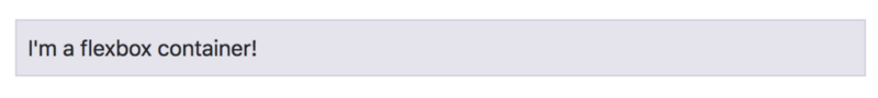
Bootstrap 4 also comes with a bunch of classes you can apply to control both Flexbox containers and items. To turn an element into a Flexbox container, simply give it the class of d-flex.
<div class="d-flex">I'm a flexbox container!</div>
Which will give you a Flexbox container with text inside it:
Note: I’m only mentioning the Flexbox related styles here.
Let’s also add a few items, and add another class to control how they’ll position themselves in the container.
<div class="d-flex `justify-content-center"`">
  <div>Flex item</div>
  <div>Flex item</div>
  <div>Flex item</div>
</div>
Which makes the items centre themselves in the container:

You can also add classes on the items themselves. Check the Flex section in the docs to learn more about that.
#4: Control spacing with classes
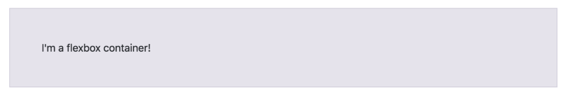
This one is pretty cool. You can now control the padding and margins using the p-* and m-* classes. The range goes from 0.25 rem to 3 rem through applying the numbers from 0 to 5.
For example, let’s give our Flexbox container a p-5 class, in order to create as much padding as possible:
<div class="d-flex p-5">I'm a flexbox container!</div>
Here’s how that will look:
You can also add t, b, r og l if you want spacing on specific sides (top, bottom, right, left), like this:
<div class="d-flex pl-5">I'm a flexbox container!</div>
That will only add padding on the left side, like this:

Note: the original flexbox container actually had a _p-2_ class by default.
#5: From pixels to rems
Bootstrap 4 has swapped out pixels with relative units of measurements (rems) in all places except media queries and grid behaviours. This means more flexibility and responsiveness, as rem units aren’t absolute, which pixels are.
With rems all font sizes are relative to the root element (the html tag), and by default, 1rem equals 16px. However, if you change the font-size to, say, 50% in the root element, then 1rem will equal 8px throughout the app.
Note that this switch doesn’t mean that you need to use rems when you’re applying your own styles on your website.
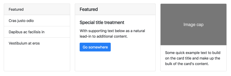
#6: Cards replace panels, wells, and thumbnails
Bootstrap also comes with a whole new component called cards, which replace panels, wells, and thumbnails. A card is a flexible and extensible content container. It includes options for headers and footers, a wide variety of content, contextual background colours, and powerful display options.
#7: Goodbye IE9
Bootstrap v4 has dropped support for IE8, IE9, and iOS 6. v4 is now only IE10+ and iOS 7+. For sites needing either of those, use v3.
There are of course many more changes which didn’t make it into this article, so check out the Migration section in the docs to see all the changes.
Finally, if you want to learn Bootstrap v4 properly, be sure to check out our free course on Scrimba.
Also, when you’ve gotten this far, feel free to connect with me via Twitter:
Thanks for reading! My name is Per, I’m the co-founder of Scrimba, and I love helping people learn new skills. Follow me on Twitter if you’d like to be notified about new articles and resources.
Thanks for reading! My name is Per Borgen, I'm the co-founder of Scrimba – the easiest way to learn to code. You should check out our responsive web design bootcamp if want to learn to build modern website on a professional level.